Here is a transcript of his speech :
« SPIP’s graphic identity is felt as aging. Its logo suffers some weaknesses and, websites in its "galaxy" [1] could totally use a re-branding & design refreshing.
As a regular SPIP user — which I use to work with on 31mille web agency’s projects, as an artistic director — here is my contribution to re-think and modernize SPIP’s branding.
Redesigning graphic identity should first ensure all SPIP users about the project and, the dynamism the Community has been carrying around on for 16 years. Default achievement being at least, showcasing a modern front-office to new comers.
With this upgrade, like we do for a software, improving graphic identity brings to any structured environment more flexibility, making it perfectly scalable to new medias and devices.
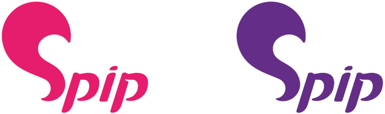
Working concept relies on a synthesis between SPIP’s power animal, the flying squirrel, and the letter « S ».
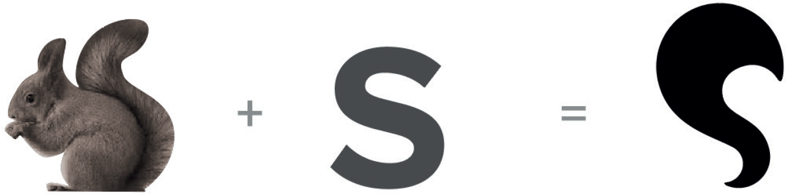
For typography purposes, we draw a character that keeps the dynamism brought by a sans-serif, emphasized by italic font and, by adding discrete serifs to it. Part of actual logo’s typography is kept in the « p » curve.

A detachment in second « p »’s eye, reminds of the power animal, symbolizing the squirrel’s hear. Then appears the « squirrel-shaped word », with its head, body, and a feathery tail.
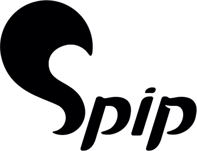
A logo’s strength stands in its rhythm. Feathery tail’s lower curve is repeated across the two letters « p ». This redundancy brings the needed dynamism and, empowers the global consistency, meaning to identify and memorize the feathery tail symbol..
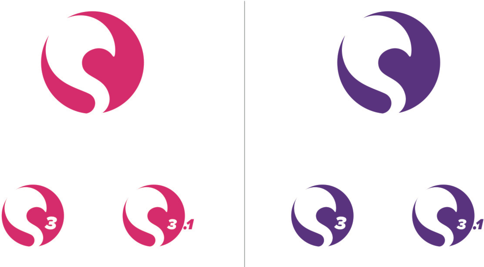
The feathery tail may totally be used alone and then become SPIP’s graphic identifier.

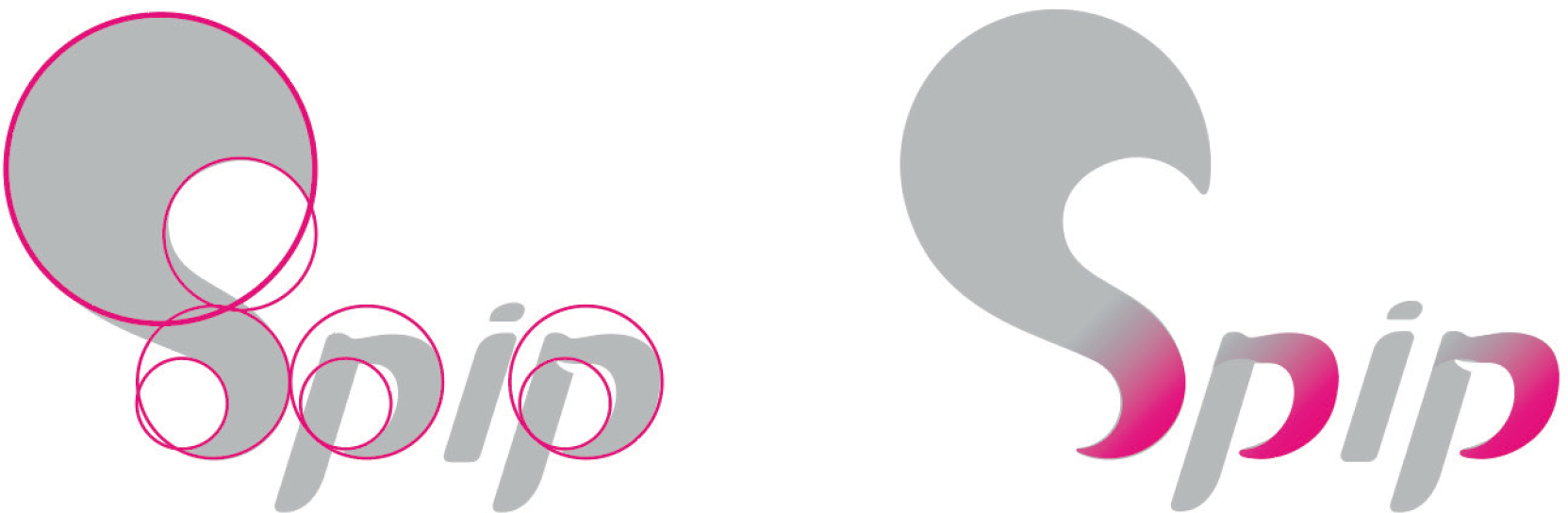
Modernizing a graphic identity also involves a color refresh. Purple, historical ’legacy’ color, now tends to a more actual, brighter & electric hue, so that you clearly can’t miss, but recognize SPIP’s Identity.
Using both colors remains however possible, depending on the uses, website’s topics and/or devices ...
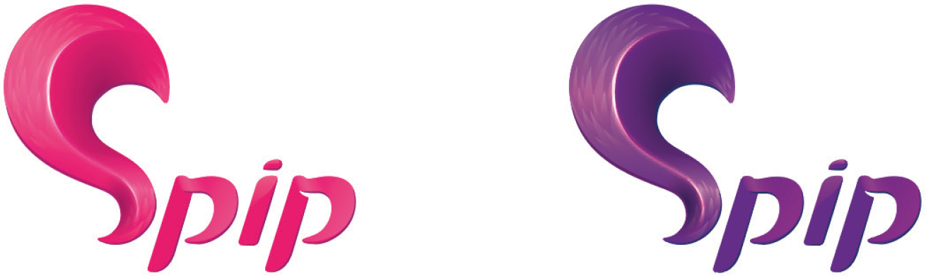
Once the symbol is set, any pictural tweaking can be used for larger displays. Like this one, from a graphic code in reference to Mozilla Firefox :
Using the feathery tail as a graphic symbol being set, identifying SPIP is made possible as soon as one sees the particular curve of the tail.
Shaped by a rounded background, symbol keeps being perfectly usable in small sized displays, like a favicon.
And now this is a design refresh proposal for SPIP’s galaxy websites :
This is the graphic identity I imagined for SPIP’s community, to be its first spokes person and amplifier.
Jordan Zucchiatti »
The initial point being agreed on among the Community, this new logo and proposal for a new graphic identity were warmly welcomed by the party attendees.
Sources for the logo and variations (favicon, relief, site title and purple declination) are available on Spip-Zone SVN repository [2], in SVG and PNG formats :
https://zone.spip.org/trac/spip-zone/browser/_graphismes_/logos/spip/spip_2017
Update on 07/31/2017 :
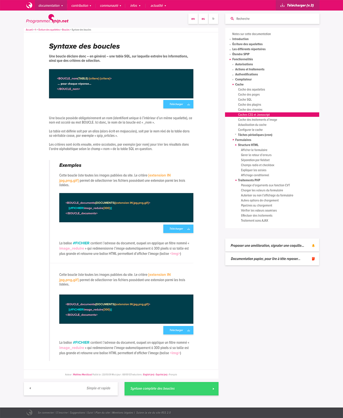
Jordan’s mock up has been packaged into a new scalable & skin-able template-plugin Galactic.
A first version was made for the developper’s documentation website redesign : https://programmer.spip.net/
Templates and their first skin are free to download on Spip-Zone SVN repository :
https://zone.spip.org/trac/spip-zone/changeset/105541
Update on December 11th 2018 :
By the time that post was translated & published in english, the ’Galactic’ templates are already nicely at work on following SPIP Galaxy’s websites :
- official SPIP website
- official SPIP community forums
- SPIP plugins & templates’ developers guide
- SPIP Contrib (This exact one ! Yeah !)
Aucune discussion
Ajouter un commentaire
Avant de faire part d’un problème sur un plugin X, merci de lire ce qui suit :
Merci d’avance pour les personnes qui vous aideront !
Par ailleurs, n’oubliez pas que les contributeurs et contributrices ont une vie en dehors de SPIP.
Suivre les commentaires : |
|
